Brand Color Choices Can Make or Break Your Investment: Lessons in Palette Selection
Color isn’t just about aesthetics—it’s about identity. The colors you choose for your brand can shape perception, influence buying decisions, and set you apart in a crowded market. But a poor choice can just as easily derail your brand, leading to unnecessary costs, inconsistency, and even confusion in the marketplace. Here’s a closer look at how to avoid common pitfalls and craft a color palette that truly works for your brand.

Ignoring CMYK Gamut Constraints
Working as a creative director for a formulations company, I proposed a palette that was copesetic across digital and print formats. The owners at the time had their own ideas, of course. They insisted on a teal tone that was brilliant on screen but impossible to match in digital or CMYK print without a custom ink mix or use of spot colors. The result? Inconsistent packaging and a big dent in the printing budget.
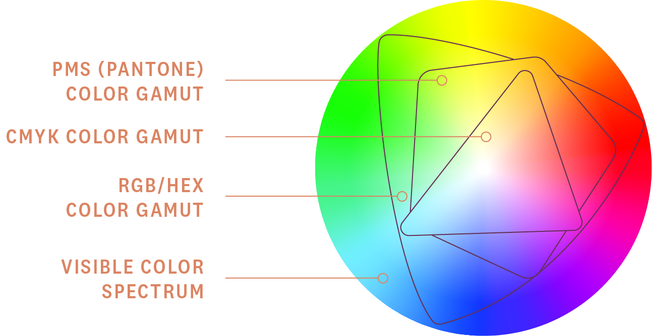
A rookie mistake in branding is overlooking the differences between CMYK (used for printing) and RGB (used for screens). While RGB offers a wide range of vibrant colors, CMYK’s gamut is narrower, which means not all colors can be reproduced accurately in print.
What happens when brands try to force digital or wide gamut colors into print? Higher costs and disappointing results. Spot colors, often necessary to replicate specific hues, can increase production costs by 20–30%—a significant strain on startups with tight budgets.
Overusing Metallics and Foils
Metallics and foils can be eye-catching, but they come with drawbacks. First, they’re expensive to produce. Second, they often don’t translate well digitally, leaving your website and social media looking flat compared to your packaging or printed materials.
When metallics are overused, brands risk appearing more focused on flash than function, alienating both their wallets and their audience.
Following Trends Blindly
Trendy colors, like Pantone’s “Color of the Year,” can feel exciting and fresh. But following trends without considering your brand’s long-term vision can lead to quick obsolescence. A trendy color may look current today, but when everyone jumps on the bandwagon, your brand can disappear into a sea of sameness—or worse, feel outdated within a year. Specifically, I remember when the “Coral” color came out from Pantone. We had an influx of six different brand requests to incorporate that tone. These six were all from the same industry and product type. So you know this was an experience every designer was having.
Neglecting Competitive Differentiation
Failing to research competitors’ color palettes is a major misstep. Choosing colors similar to a rival can confuse your audience, dilute your impact, and make it harder to stand out. Two wellness startups launched with nearly identical pastel palettes. Consumers couldn’t tell them apart, and both brands struggled to gain market share. Or as one excelled, the other just looked like they were copying their competitor.
Strategies for Effective Palette Selection
Stick to CMYK-Compatible Colors
For a consistent look across all mediums, prioritize CMYK-compatible colors. Use tools like the Pantone Bridge book to see how colors translate between CMYK and digital formats. This ensures your palette looks sharp in print, online, and everywhere in between.
Leverage Digital Tools for Color Research
There’s no need to start from scratch. There are plenty of tools out on the net to assist you in choosing the palette for you. Simple searches on how certain colors evoke specific emotions or triggers can help align a brand’s goals. Cobalt blue tones spur trust and reliability. Reds and garish tones spark caution or excitement. For competitive analysis, pair manual research with AI tools like ChatGPT to identify your competitors. Then compare palettes and spot windows of opportunities for differentiation.
Prioritize Market Research
Your color palette should not only represent your brand but also fill a gap in the market. Analyze competitors to find underutilized colors, then tailor your palette to resonate with your target audience.
FOUR TIPS TO KEEP IT SHORT AND SWEET:
- Use a Pantone Bridge book. It’s the gold standard for ensuring your colors translate well between print and digital formats.
- Avoid metallics or trendy colors as primary branding choices. Stick to timeless, cost-effective options that won’t quickly date your brand.
- Research competitors. Find opportunities to stand out by choosing a palette that’s distinctive but still relevant to your market.
- Listen to the Designer. You are paying them for a reason. If the designer has data, and provided to you in logic on how to move forward. Let them be your guide.
For startups, simplicity is key. Start with a basic palette that’s scalable and affordable, then evolve as your brand grows.
Thoughtful color selection is about more than aesthetics—it’s a strategic decision that impacts your brand’s perception, consistency, and bottom line. By avoiding common pitfalls, leveraging the right tools, and prioritizing research, you can craft a palette that not only looks great but also stands the test of time.
The right colors don’t just make your brand memorable—they make you unstoppable.
